Interviews
Hayfaa Chalabi Drawing Democracy: Illustration, Collective Sense-Making and Visual Resistance

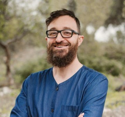
Hayfaa Chalabi is an illustrator and educator whose practice explores the role of illustration in uncovering, questioning and re-contextualising histories that have been silenced or marginalised. As Senior Lecturer and Coordinator for Critical Practice at the University of the Arts London, she approaches illustration through a feminist and decolonial lens, challenging the idea that visual communication can ever be neutral or detached from politics.
Her work invites us to think about illustration not simply as a way of representing or explaining the world, but as a means of questioning how that world is made visible in the first place: whose stories are told, whose experiences are recognised, and which forms of knowledge are granted authority. Across subjects including migration, gender, colonialism, borders and power, illustration becomes a way of reconnecting evidence with lived experience and of challenging the supposedly neutral visual languages of expert knowledge.
In this conversation, we explore illustration as a democratic practice: its capacity to transform perception, make hidden structures visible, and create spaces in which people can collectively interpret complex realities. We also discuss what happens when drawing moves beyond representation and becomes part of participation itself, not merely documenting a conversation, but actively shaping what people notice, question, imagine and understand together.
Illustration as Democratic Practice
Olivier: I’d like to start with the idea of you presenting yourself and your relationship to visual work. I’d also like you to touch a little on the techniques you usually use, and then your role in visual studies or visual literacy. Maybe also, if you have worked with data visualization in the more classical sense, like charts. I know some of your work is somehow in conversation with that. As an introduction, that would be very helpful.
Hayfaa: Yeah. I’m an illustrator and I’m also an educator. I’m a senior lecturer and coordinator for something called Critical Practice at UAL, University of the Arts London.
My position title says a lot about my practice. I work with critical illustration, or illustration that engages with social and political contexts. I’m especially interested in how to work around sensitive topics: the ethical questions of working with people from marginalized backgrounds, or even just subjects that can put people at risk of being marginalized. I work around care and ethics.
It’s important to know that in that journey there are lots of mistakes that happen, and it’s important to know how to exist with that and navigate that: to take accountability, to reach out, to work with communities, but also to understand how you enter communities in an ethnographic but ethical way.
I think one of the most important methods for me is asking whether or not the community you’re working with wants that work. Sometimes we are arrogant enough to think that we’re making work that is important, but sometimes not.
Positionality is very important: to understand your position, but also to understand the position of the people who might be impacted by the work.
So positionality is very important: to understand your position, but also to understand the position of the people who might be impacted by the work. And the people who might be impacted by the work are not necessarily just the people being visualized.
There are a lot of stakes. It is about understanding context, understanding everybody at stake, and understanding how to exist within that, or not exist, which is also a decision that we sometimes make.
I do work with journalistic illustration, or even investigative or research-based illustration. In my own practice, which is not editorial, I use those methods too. I work with magazines and newspapers, but also in my own practice that is not catered to that.
I worked with visualizing data to understand the so-called — I don’t agree with this term, but it has been established by politicians in Europe, so just to know what we are referring to, I’m going to use it — the so-called refugee crisis of 2015. I think it’s a European crisis, not a refugee crisis, but this is the established political term.
I looked at data and what it meant in terms of racism. I tried to understand it. I couldn’t get politicians or people to tell me about their racist thinking, but the data could tell me that. Sometimes data gives us answers.
One of the answers it gave me, for example, was when I was in Sweden. The far-right political party there, which has roots in neo-Nazi movements in the 1990s in Sweden, promised to close the borders when there were a lot of refugees coming in 2015. That year they got a lot of votes. Once they were actually in power and closed the borders, their votes went down.
So this data told me something about how people think about refugees, and how they would rather be ruled by a neo-Nazi party than have refugees enter. This is something very difficult to extract from people through conversation, but easier to see through data. So, yeah, that’s what I do. It’s a bit of a balance.
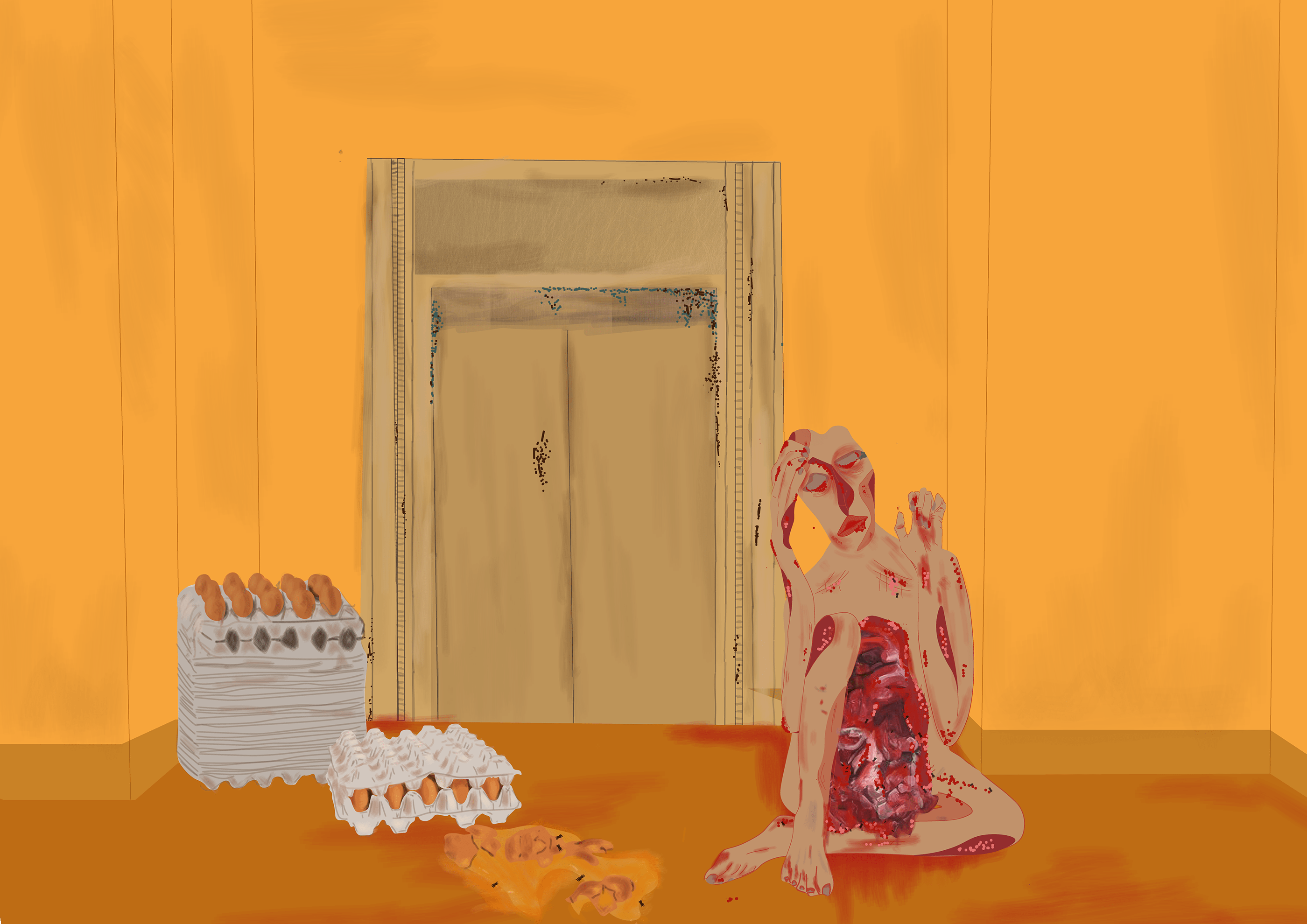
Transition (Sketch)
Hayfaa Chalabi
Data visualization as a political statement
Olivier: Actually, that was part of one of my blocks, but let’s jump into it, because I remember you presented the “Refugees Welcome” series, right? So I’ll jump straight into it. As you mentioned, the project is placing statistics. If I remember well, asylum applications and political opinion on one side, if you categorize it like that alongside intimate illustrations of refugee experiences. My question would be: what can illustration communicate that data alone cannot? And what is the role of each of these different prisms?
Hayfaa: Visualization makes data accessible, which is very important, because people should be able to access data in order to be informed about what is happening in the world, and then to inform back.
In order for us to act towards any political or social context, we need to understand what kind of statistical information we have about that place. Just like I told you, for example, in order for us to combat racism, we need to understand that it exists. Sometimes it’s difficult to understand that when you’re interviewing people, when you’re using methods that are more human-interaction-based. Sometimes you need the numbers, because they do give you additional information.
In addition to that, visualization can humanize the data and remind us that this data is about humans, because we often forget that.
Especially from this part of the world where we live. I’m based in London having a Eurocentric access to information means we are often visualizing or speaking about people from SWANA, for example, the global majority, or the so-called third world. And “third world” is actually not, in international politics, a bad term in the way people sometimes understand it. It was a term that rejected the first world and second world, and it was established after the Cold War. So it is not a bad term, but we need to contextualize it when we say it.
When we speak about people from the global majority, if that is the term we choose to use in this context, there is a lot of dehumanization in how they are depicted in a Eurocentric context. Visualizing data is important because, most of the time, the data we have about other countries here is dehumanizing. However, visualizing it can also end up dehumanizing it.
So, again, it is about how we humanize. How do we bring people in without just looking at their oppression, without limiting them to stereotypes? How do we tell their stories as human beings beyond just numbers?
From this Eurocentric perspective, it is often the case that we forget that people outside Europe or North America are humans with feelings, experiences, families, lives, and hopes.
Olivier: Talking about feelings and emotions, many public debates, because the paper we are writing is in the context of a broader deliberation, this wave of citizens’ assemblies that expose people to a topic, really depend on experts presenting statistics. Most of them are typical charts. They are understandable, but many public debates separate facts from emotions.
In a citizens’ assembly, you are not supposed to feel any emotion looking at data. I remember in your illustration you redrew some typical charts, integrating a more emotional visual language using the data itself. It offers another reading.
Was one of your goals to create a visual language where evidence and empathy reinforce one another rather than compete?
Hayfaa: Yeah. There is so much to this question.
First of all, the person who is visualizing the data is also revisiting the ethics of the data. Sometimes we forget. For example, now we have a genocide going on. A lot of the information you get is about women and children. What about men? They are humans with us in this genocide. They are being murdered, killed, experiencing the same.
Also, putting women and children into one statistical category is wrong, because they are two groups of people as well. And then children: there is gender, ability and disability; there is a lot to it.
I think a lot of people who work with numbers and numbers alone forget this categorization of humans, or the categories that exist within humans. The person who is visualizing is also revisiting the data. It is not only taking it as it is and visualizing it as it is, but also asking: does this data already do the job of humanizing?
If it doesn’t, then how can I create a visualization that looks even at the lack of that information? Can we visualize this lack? For example, if I am not getting information about how men are impacted by war, can I visualize that lack in that way?
It is dehumanizing to put different lives into one number. Visualization sometimes gives us access to looking at one story, even if it is just one story. It tells us something about the human experience
But also, bringing people into the data means we need to understand that the visualization looks at the human experience. If you have numbers about how people are impacted by war, what does that really tell us? If a person who does not live in that war zone gets that information, how much are they moved to act towards that cause?
If they are just getting a number. If I tell you 1,500 people are killed a day, how is that different from telling you, or visualizing, the story of every person and what they went through, their journey?
It is dehumanizing to put different lives into one number. Visualization sometimes gives us access to looking at one story, even if it is just one story. It tells us something about the human experience. Our action towards that cause becomes different because we can relate.
It’s a bit selfish, how we access information and how we act. But I think the more distant a cause is from us, the more distant a visualization is for us, the less motivation we have to act towards it.
Here, the importance of bringing empathy into data is to make a story really relatable. It is basically saying: this person is struggling just because of geographical luck. That’s it. But at the end of the day, we are all human.
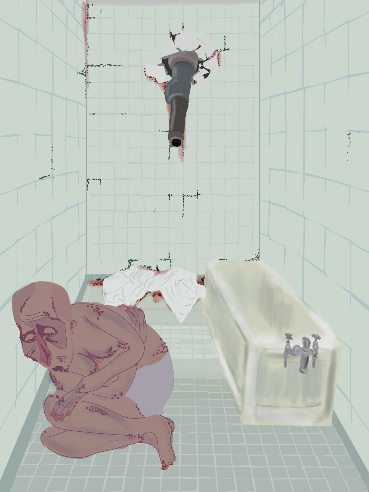
A Terrorist Diary? (visual series)
Hayfaa Chalabi
Visualisation as Deliberative Infrastructure
Olivier: It is very interesting to catch up on two things you said: the idea of letting silence be visualized. In most deliberation processes, institutions are obsessed with facts. This is a bit outside the scope of the interview, but in citizens’ assemblies, for example, they use sortition, random selection, which is never perfect because you never reach the most marginalized people. In Spain, if you do any positive process on migration, most migrants could not be randomly selected because they have no papers. How do you express that silence? That is a real issue and blockage for us.
And then there is the imitation of expert language. What you see at the end of the chain is that the proposals made by citizens often look a lot like the expert presentations at the beginning. There is no space for interpretation or conflict. That’s why I think visualizing data could be very powerful. It would force people to stop talking or simply listening to experts, to emotionally feel and interpret the data, and then be asked again what is not present in the data and should be present in their recommendations. Do you think visual language should be applicable in citizen deliberation, which is usually only about discursive language?
Hayfaa: Yeah, absolutely. Collaboration is all about that.
One case comes to mind. I don’t know if you know about this or remember, but during the Arab Spring, the series of revolutions that happened in the Arab world, in Egypt, the media was very monopolized by the government, by the army that was committing crimes and massacres against the people.
People were being killed without anything being reported about them. Nobody was seeing them. Nobody in the world was able to report what was happening because the media was monopolized by the army that was in charge, and still is in charge.
So people started to draw the faces of all the people killed, and their stories, on the walls in the streets. There was a movement of street art that was collaborative. It was initiated by street artists. I know their names, but you would never find a signature on any of the murals, because that was not the point. It was not about the ego of the artist, although now when I see the style, I can recognize which artist it was. It was a collaboration between people.
Participation is so important because the street witnesses
People witnessed things that maybe not all the artists witnessed. There were walls in the square where the revolution was happening that were filled with the names and faces of martyrs. The official line was: “This is just a lie. They’re not dying. These are just people lying.”
But then the government was faced with these walls. There was an election happening where the government, or the military, was re-electing itself, and it had just committed a massacre. Its chances were not great because the streets were filled with its crimes, visualized by the people.
So what the current president did back then was start to destroy the walls. Painting over them would also expose him, because it was during the election and it would be so obvious. So some of the walls were demolished.
Olivier: Not even painted white?
Hayfaa: No, because painting over them would expose him. He said, basically: “Actually, we need to reconstruct this place. There are some reconstruction problems here.” I went to Egypt recently, and there were only one or two murals left of martyrs who died during that time.
Participation is so important because the street witnesses. Citizen journalism is what we see now in the genocide as well. If there weren’t people filming from inside Gaza, so many stories would simply not happen. The global public opinion about what is happening would have been shaped just like it had been shaped by the US and Israel before the telephone.
We’ve had this genocide since 1948, and the public opinion was different. But citizen journalism, citizen collaboration in visualizing shapes public opinion, and thus shapes how we move, how we create laws, policies, and everything. So collaboration is everything.
Bodies, Space and Embodiment
Olivier: Let’s open up a block around bodies, space and embodiment. Many of your illustrations involve bodies, movements and relationships, rather than abstract diagrams. How important is embodiment in political illustration? And further on, how can political illustration help people deliberate better, or help politicians take decisions?
Hayfaa: It does many things.
First of all, abstract diagrams project neutrality, or claimed neutrality, because I don’t believe neutrality exists, especially with numbers, stories, politics. It doesn’t. This claim of neutrality, which looks like a chart, actually causes people not to act, and therefore causes policies and laws not to change.
This neutralization of data visualization has a huge impact, even in something as small as the fonts used. There are fonts that are considered neutral, like Helvetica, for example, a Swiss font. These fonts are often used by far-right parties in Europe. This is something they have in common: neutral fonts.
That is because their discourse is full of hate, but they neutralize it or minimize the hate by using a font that looks friendly or neutral. The neutrality, or the neutral look, is very intentional, and it has a huge impact. It has been tested and studied for years, and it is very much intentional.
So if you reproduce it, you are reproducing that narrative.
Bringing the body into illustration reminds people, first of all, that it is confrontational. It confronts people: this is about a human here. I am not just telling you 1,500 people were killed. No, look at the killed people. It is difficult. It is challenging. It moves something in you. It makes you want to do something.
It is also exposing. If policy does not change, we have a visualized record of human suffering. If politicians refuse to change whatever is happening, whatever the suffering is, we have a visual record of that history and of the failure of politicians.
This is important for historical documents, and for us to build up a case against whatever oppressor we are speaking about. That is how I see its importance.
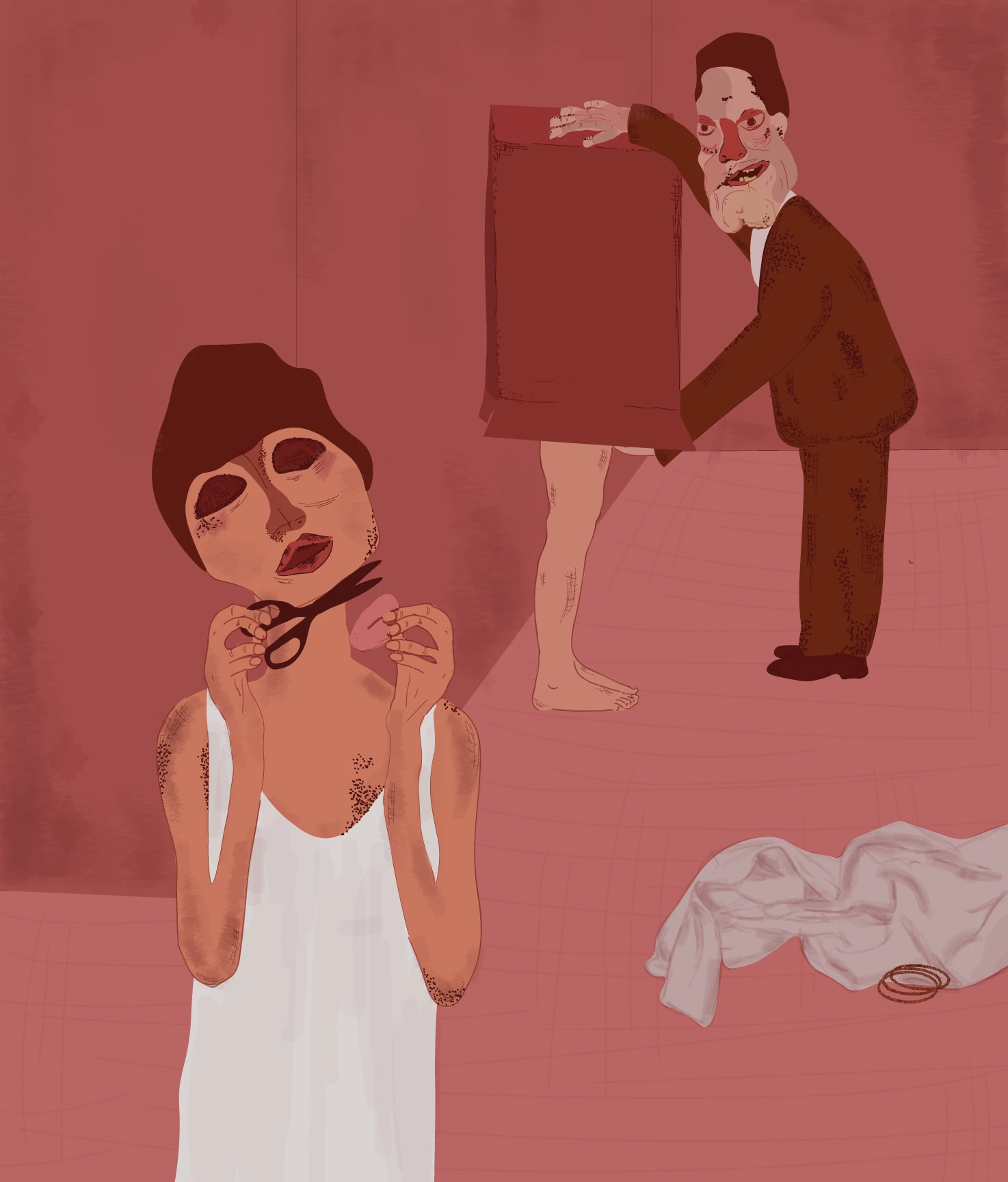
In The Name Of Modesty (illustrated series)
Hayfaa Chalabi
Olivier: In your work you tend not to illustrate isolated events. Your work often creates visual landscapes, I would say, or spatial stories. Do you consciously design your illustrations as spaces for exploration? Could you also tell us a bit more about how you display your work? If you think about verticality, horizontality, whether people can feel safe to discuss and interpret, have you had any experience where you had a conversation with the public?
Hayfaa: Yeah, I did. Sometimes it’s good, sometimes it’s bad. But I think that’s good as well.
For example, I did this work about migration, and I made a film about it. It was a lot about space, because the space of immigration offices limited the right of the person going through that process to document whatever happens.
If you go inside the office, there are lots of cameras watching you, but there are also lots of signs telling you you are not allowed to watch back. There is almost this panoptic, prison-like design, where you are being watched and are not able to watch back, as a form of power, as a form of limitation, fear, threat, and so on.
I remember I showed this work in a cinema. There was one person who asked me: “Why aren’t you showing good examples of migration officers?” Another person asked me: “Why are you making this film in English? This is Sweden, why are you using…?”
These questions are silly, I think, but they are important. They might sound ridiculous to someone who is advanced in this conversation. For example, I went through 11 years of investigation meetings with immigration officers. The person who asked me did not go through any, but suggested that there are good immigration officers. They never met any in that context. Maybe they know them personally outside of that context, but they haven’t met any in that context.
But these questions are so important to unpack. If you look at political discourse in different countries, if you look at political debates between parties, a lot of the time when a racist party says something racist, the other parties do not unpack it. They just say: “This is racist, this is racist.”
And this does not help, because people who are convinced by those racist beliefs are not given a chance, as humans, to unpack that. They are humans at the end of the day, and they might have a good heart. If we help them through a conversation, we might get somewhere. We might not, but we might.
I think it is our responsibility as artists, or as people who work with these questions, to sometimes sit and do that kind of one-on-one explanation of racism. And I wish that people with more privileged positions understood that this is their homework, not our homework
I think it is our responsibility as artists, or as people who work with these questions, to sometimes sit and do that kind of one-on-one explanation of racism. And I wish that people with more privileged positions understood that this is their homework, not our homework.
It is not the homework of the person oppressed by racism to unpack racism. It is the homework of the person who comes from a history that has enabled racism to unpack racism. I cannot be oppressed by racism and then be paid pennies to clean it up. It doesn’t work.
Olivier: So how would this unpacking process look? Specifically thinking of visual literacy as a democratic capability for young people who are under the influence of simple messages from the extreme: how would this unpacking happen?
Hayfaa: One of the things is making visual data accessible. Lots of data visualization is super complex. Nobody can read it. I look at it and I’m dizzy already, as an artist myself.
I think lots of people who visualize data are data journalists or data scientists, rather than artists who work with people and understand how people understand. Literally, the size of a font, or the combination of two colours, can make something inaccessible for colour-blind people to read. Simple visual elements need to be unpacked.
There is something about the importance of beauty in data, in making data accessible and readable, consciously and ethically, but also just in terms of making it look pretty, accessible and approachable. It is really important.
But also, it is not only young people who are racist.
Workshops as Collective Visualisation
Olivier: Talking about this, how can creative workshops (as our collaboration ar inDICEs), physical workshops, help people move from being consumers of images, or messages inside images, or simple messages, towards being authors of their own interpretations of public narratives? How would that look?
Hayfaa: There are so many factors that go into this. First of all: what groups of people are we working with, in what context, and in what language?
Most importantly, I think it is about making the people taking part in these workshops understand their relevance: the relevance of human participation when it comes to data visualization; the relevance of human input; the relevance of their input in policymaking when they take part in these workshops.
It is also about highlighting the relevance and importance of witnessing, human witnessing. Human witnessing is everything we need to report on, just like the case of Egypt I told you about. The media and policymakers do not always have people’s benefit in their intentions or agenda.
How can we collectively, as people, participate in this workshop? How can we make people understand that their power of witnessing and recording back on that witnessing is the most important human participation we can have in policymaking?
It records history. It records what actually happens on the ground, even more than reporters who work for a certain channel with a certain agenda and report with that language.
How can we be inclusive in that conversation and make people understand that their power of witnessing and recording back on that witnessing is the most important human participation we can have in policymaking?
Olivier: I have that impression too. We use lots of fanzines, for example. We have been working on a project on mindset evolution with young people under 18 from Manchester and Barcelona, using theatre, which is another very interesting scope. We also use the idea of visualizing a picture of oppression without words, which is very related to visualizing with your own body. Once we have a policy recommendation for policymakers, which is technically difficult for them to consume, we start creating fanzines, very visual ones. We also developed some kind of tarot for envisioning the future of these recommendations if they are not adopted. The tarot victim was the policymaker who was acquiring the commitment. Do you think drawing and other non-discursive forms could be a bridge to data literacy? Could illustration become a gateway to data literacy?
Hayfaa: Absolutely. Especially fanzines. Their history is rebellious. It is an alternative form of magazine. A lot of people think it was developed by queer people in the US, but actually it was developed before that by Black people. I think even in the 1920s, Black people felt they were never represented as successful, artistic or sophisticated. They were always represented as criminals, or through other racist frames.
The format of the fanzine is super relevant here. It is an alternative way of reporting. I definitely think that, maybe, young people are not able to look at all the statistics. But, as I said, taking one story from the statistics and unpacking it in a fanzine humanizes whatever statistics we are looking at.
This way of visualizing, writing about or drawing in a fanzine — looking at stories out of numbers, or creating a narrative about the numbers — comes from a very rebellious history of refusing normative formats of storytelling, going against the norm, going against the government and the rule in power. So, yes, absolutely. It is very humanizing of the data.
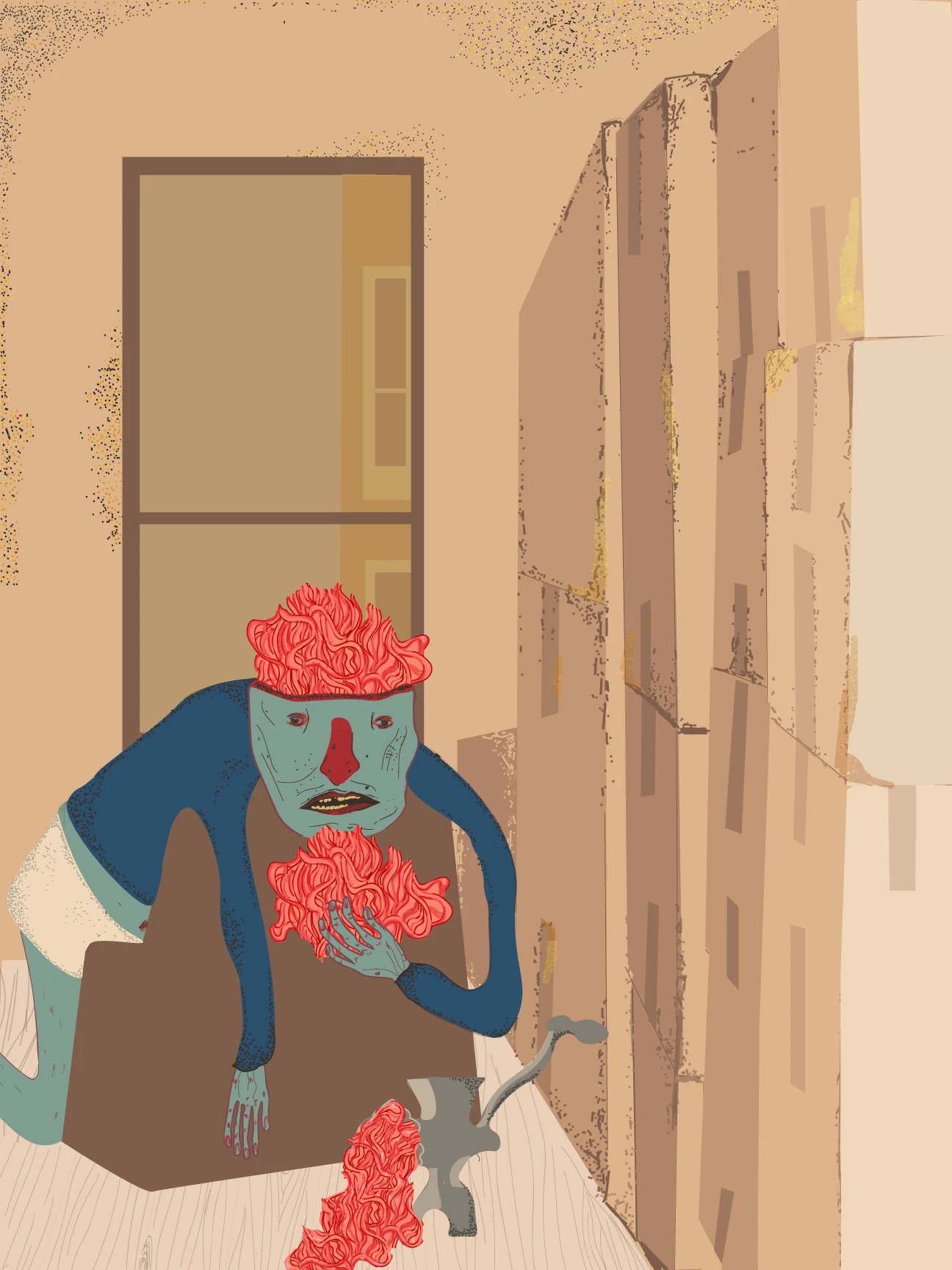
Obsessive consumption (illustrated series)
Hayfaa Chalabi
Counter-Visualisation
Olivier: Sometimes I think your work, and the work of other more visual or political artists, is about competing with expert authority. Usually, when governments, international organizations or even NGOs publish reports, their authority often comes from numbers and graphs. Illustration does not usually claim the same kind of authority. So what kind of authority does illustration have? Is it a counter-power?
Hayfaa: Yeah, it is a counter-power, but it also recontextualizes power.
Sometimes I reject the report itself that comes from the NGO. Why was it made in the first place? There was an article, for example, during the Syrian war, by the Daily Mail, which is a right-wing British newspaper, about how the war in Syria had given lesbians the freedom to practice sex. This is a news article published in the UK, for UK readers.
What does it do? What is it trying to do? What is the point of this publication? The point is to sexualize certain people. Whenever we have oppression, sexualization is also part of that oppression.
So sometimes I reject the report altogether. I do not think there is relevance in that report. Or if there is a report again and again and again about women and children, without any reports on men, that is very dangerous as well, because it is easy to look at Arab men, for example, or men of colour, in a certain way.
When there is a lack of that report, you are also reinforcing a narrative by not even touching on it. I am not even talking about men, but by not talking about them, you are vilifying them.
So sometimes I go against the report. Sometimes I reject the data coming from authorities above me, or the information that is coming from them. I feel that an illustrator has the power to reject, to counter, to recontextualize, to re-explore — all of this together, but mostly to reject.
Olivier: Have you worked with other media or with artists in a collective, so that your illustrations were part of a more collective agenda, as sound, theatre, or other techniques?
Hayfaa: I have mostly worked with text, to be honest. But yes, mural and film. I worked with film. I have worked with music before as well, but not other media so much.
I do not only work independently. I work with magazines that have agendas, but agendas that I agree with. So I do work with the collective, but mostly with text.
Olivier: I was also checking your illustrations for The Shadow Map. Which one of these do you think would potentially work best in a citizen-like space, where people could, instead of listening to experts and looking at data, encounter one of your illustrations as a trigger for conversation?
Hayfaa: There was one article about an organization that works with accessibility in Palestine. I did not take stories from the text. The illustration was not based on stories from the text. The text was about accessibility in general, and analyzing what that means, but I picked different stories that had actually happened and that I wanted to visualize because not a lot of people had talked about them.
For example, this kid with Down syndrome who was attacked by the IDF, separated from his parents and attacked by the dogs of the IDF until he died. Or I looked at the football club of people who are amputated because of the war.
I did not bring elements from the text. I brought elements from stories that I thought needed to be brought into the text but were not. The text is great — no offense to the text — but I felt that in a conversation about accessibility in Palestine, I wanted to highlight these different stories.
They were not all stories of oppression, and that was important for me, because I do not want to dehumanize Palestinians into only oppression. The football club of amputated people was more about resilience, strength and joy: how people find joy even when they lose body parts in war.
So, yeah, I feel that could maybe start some conversation in public.
Olivier: By contributing stories that aren’t in the text, as you mentioned, you’re opening up, or forcing, the creation of a space. That’s what interests us most, and we’ve explored it, for example, in our research on the 1900 Paris World’s Fair and the work of W.E.B. Du Bois. What does his work suggest to you?
Hayfaa: Du Bois, the graphic artist? I am familiar with Du Bois’s work. When I was looking at zines, I was also looking at magazines by Black people, and generally by Black women in the 1920s, but not statistics specifically.
I have looked at work where there was a lack of statistics, or a lack of stories, and how people tried to fill that. Saidiya Hartman, for example, writes about Black histories. She was investigating the stories of Black women in the 1920s, and she did not find anything but criminal records in the police archives. So she was trying to fill those gaps.
I would love to. I am very open to it.
__
This interview is part of a series contributing to a paper by Szilvia Nagy and Olivier Schulbaum exploring visualisation and spatialisation as practices of co-design, participation and democratic decision-making. The paper is currently being developed for the CoDesign Special Issue, Designing Democratic Innovation: Co-design and the Futures of Participation in Governance.